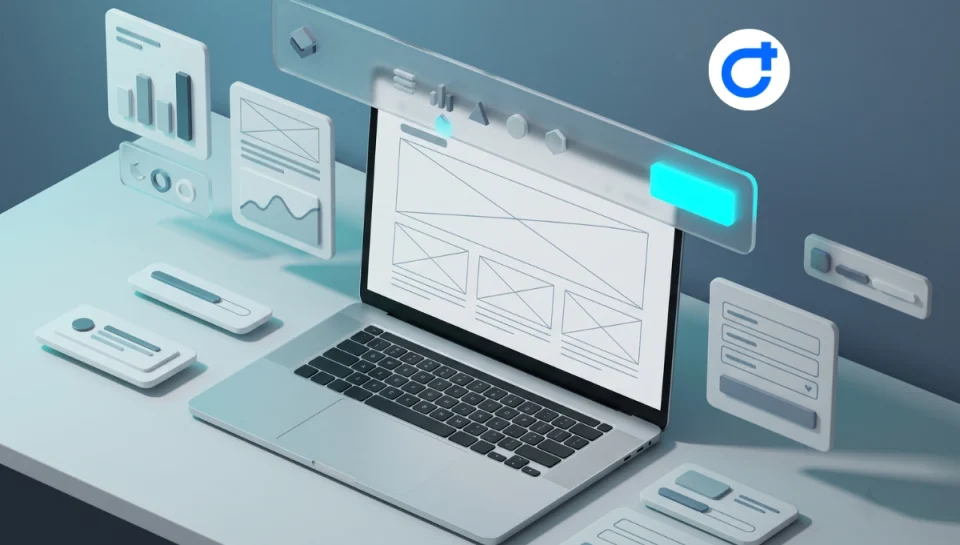
Navigation represents the central backbone of user experience on any website. A well-structured header guides visitors to key service offerings, reduces bounce rates, and ensures seamless conversion pathways. However, many website owners make the mistake of installing multiple heavy third-party plugins just to create custom header wordpress theme layouts, unintentionally bloating page size and slowing down Time to First Byte (TTFB).
Learning how to create custom header wordpress theme structures natively or through built-in framework tools eliminates unnecessary script overhead while granting full control over visual branding, sticky navigation effects, and mobile drawer layouts.
This practical guide walks through the architectural principles and step-by-step process of building responsive headers and sticky navigation bars. Master the exact blueprint to create custom header wordpress theme elements without relying on standalone header plugins.
Table of Contents
Why Avoid Standalone Header Plugins?
Every additional plugin installed in WordPress introduces external CSS stylesheets, JavaScript files, and extra database options. Standalone header and sticky menu plugins frequently load monolithic script files on every single page URL—even when only a simple CSS rule is required.
According to official standards from the WordPress Navigation Menu Handbook, utilizing core WordPress menu functions or native theme builder frameworks ensures cleaner Document Object Model (DOM) trees and eliminates asset conflicts during major platform updates.
When you choose to create custom header wordpress theme templates through clean code or native framework builders, you protect your site’s Cumulative Layout Shift (CLS) and keep the main browser thread responsive.
Key Anatomy of a Modern Business Header
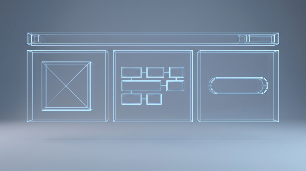
A professional header balances identity, navigation, and conversion triggers. When preparing to create custom header wordpress theme components, most modern layouts comprise three functional areas:
- Top Notification Bar (Optional): Displays business hours, direct phone links, language switchers, or promotional announcements.
- Primary Brand & Navigation Container: Houses the brand logo, primary navigation menu, and search triggers.
- Action & Conversion Hub: Features prominent Call to Action (CTA) buttons, consultation booking links, or client portal sign-ins.
4 Steps to Create Custom Header WordPress Theme Layouts
Follow these four practical steps to configure a lightweight, responsive header:
Step 1: Define Grid Structure and Alignment
Begin by dividing your header container into a 3-column or flex container layout. Keep container nesting minimal to prevent deep DOM trees. Position your logo on the left, primary navigation links in the center, and conversion elements on the right.
Step 2: Assign Nav Menus & Action Buttons
Organize your primary menu hierarchy under Appearance > Menus in the WordPress dashboard. Keep top-level items limited to 5–7 core pages to prevent visual clutter, grouping secondary services into clean dropdown sub-menus.
Step 3: Implement Lightweight Sticky Navigation
Rather than injecting heavy JavaScript libraries to calculate window scroll offsets, you can achieve smooth sticky behavior using modern CSS position properties:
.site-header-sticky {
  position: -webkit-sticky;
  position: sticky;
  top: 0;
  z-index: 999;
  transition: all 0.3s ease-in-out;
  background-color: #ffffff;
  box-shadow: 0 2px 10px rgba(0, 0, 0, 0.05);
}
As documented on MDN Web Docs on CSS Position Sticky, native CSS sticky positioning utilizes hardware acceleration and avoids main-thread calculation delays, ensuring butter-smooth scrolling on all devices.
Step 4: Optimize Off-Canvas Mobile Drawers
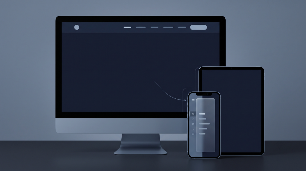
Desktop navigation structures rarely translate directly to mobile screens. When you create custom header wordpress theme designs, ensure your header triggers a lightweight off-canvas hamburger drawer on viewports smaller than 992px, allowing smartphone visitors to navigate sub-menus with effortless thumb interactions.
How CaseThemes Simplifies Header Customization
Premium business templates from CaseThemes—including flagship themes like Consultio, Bixol, and Itfirm—come equipped with purpose-built header and footer builders integrated directly into the core theme framework.
- Zero Plugin Bloat: You can effortlessly create custom header wordpress theme variations, transparent headers, and sticky scroll effects using built-in Elementor header widgets without installing third-party add-on packs.
- Multiple Pre-Built Header Templates: Switch effortlessly between classic corporate bars, center-aligned navigation, and modern split layouts with one click.
- Comprehensive Customization Guidance: Detailed visual walkthroughs and developer hooks can be explored inside the official CaseThemes Documentation Center.
Need a Bespoke Header & Tailored Website Architecture?
Structuring custom header hierarchies, off-canvas megamenus, and localized navigation flows requires careful design precision. If your organization prefers a turnkey web build tailored to your exact brand specifications, professional development support is ready to assist.
Through the Order a Custom Website Service from CaseThemes, our experienced engineers build fast, responsive, and performance-hardened WordPress websites designed to convert visitors into loyal clients.
Summary
Knowing how to create custom header wordpress theme templates natively ensures your site delivers fast loading speeds, clean DOM hierarchies, and intuitive navigation across all screen sizes.
Ready to build a faster, better-structured website?
- Explore Modern Business Themes: View our full catalog at CaseThemes Themes Directory.
- Setup Tutorials: Access detailed configuration guides on the CaseThemes Documentation Center.
- Tailored Development: Request a custom build via Order a Custom Website.